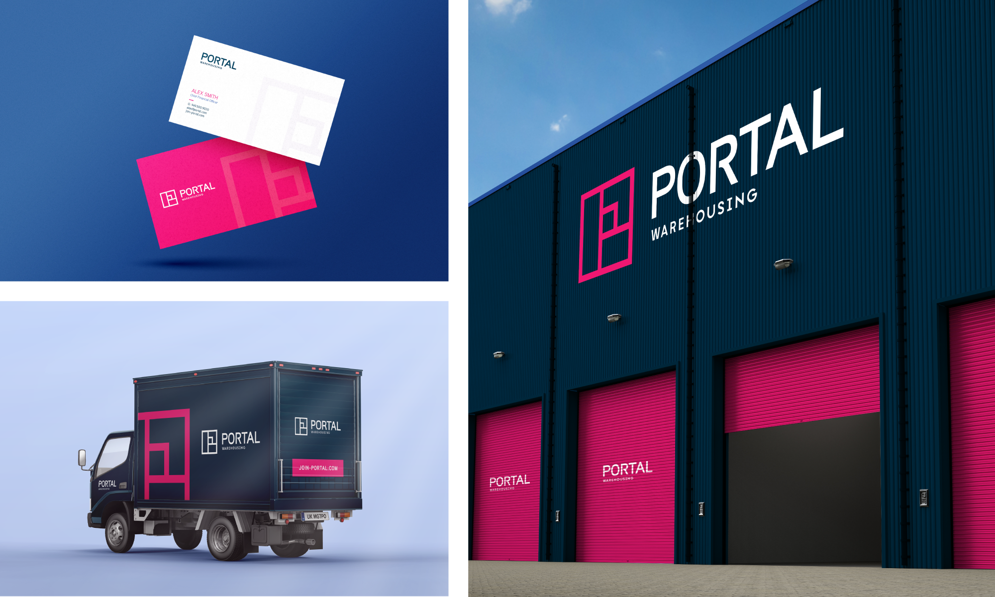
Portal Warehousing
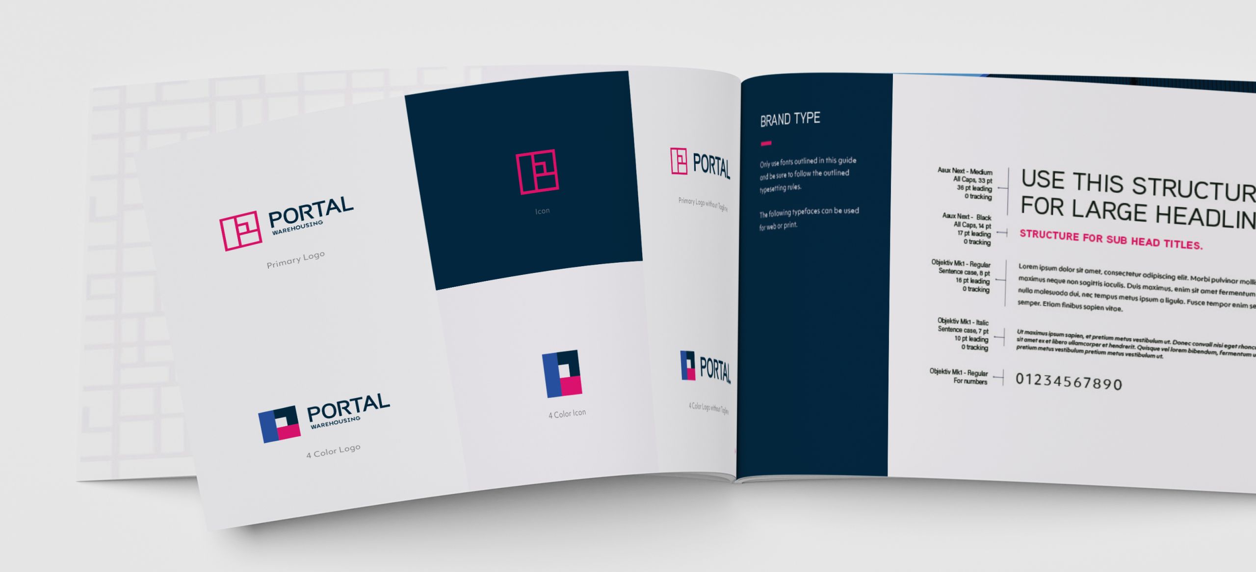
The logo design process focused on creating a distinctive mark that represented structure and organization. Exploration centered around geometric forms and modular shapes that could communicate the idea of interconnected systems while remaining simple and memorable. The final mark was developed using a series of stacked boxes arranged to create the letter “P,” reinforcing the brand name and warehousing focus through negative space and shape recognition. This approach allowed the logo to feel both modern and architectural, balancing minimalism with strong visual symbolism.
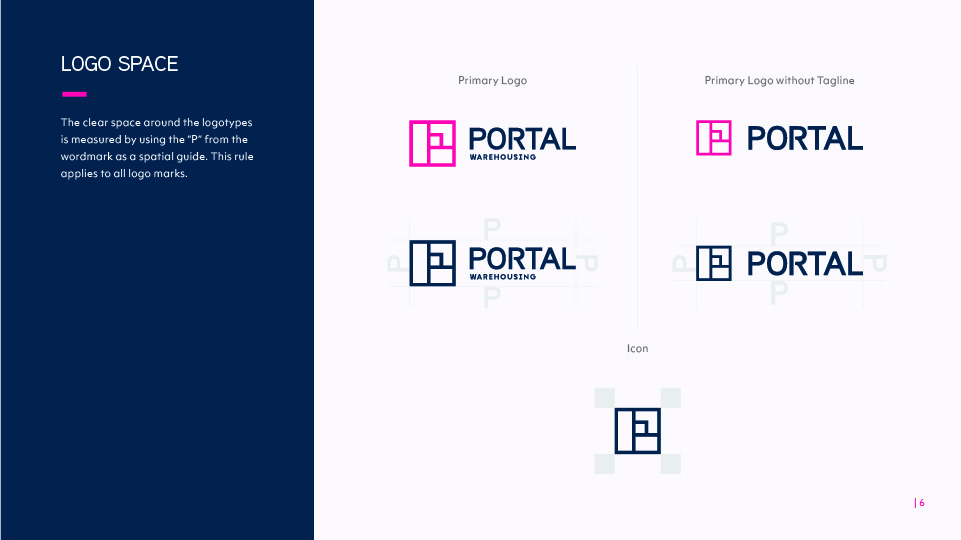
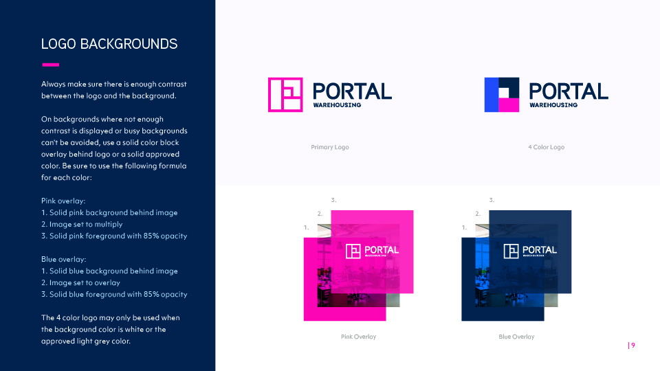
Careful attention was given to proportion, spacing, and scalability to ensure the mark remained recognizable across a wide range of applications, from large-format branding to small collateral and digital use cases. The vibrant magenta and layered blue color palette was chosen to create energetic contrast that gives the brand a contemporary and recognizable visual identity.